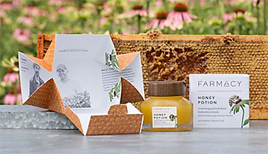
- Packaging for Farmacy‟s Honey Potion epitomises Mintel‟s 2017 Global Packaging Trend, “Re-union of Structure and Branding”.
- Structures and graphics for both the primary and secondary package reinforce the brand‟s natural ingredients and local connections.
- Romance copy on the interior of the secondary package tells the story of how farmer and science worked together to bring the product to life.
Package Focus: Unique structure, graphics and messaging reinforces core brand positioning
Brand and Product Name: Farmacy Honey Potion
Package Innovative Factors: Honeycomb shaped primary package with wood-grain-look magnetic lid and application spatula; origami-like secondary carton that unfolds to reveal the brand‟s story.
 At a time when brands are re-embracing the use of unique structures to create differentiation on shelf, few have achieved the degree of symmetry between structure and branding as Farmacy‟s Honey Potion. Where so many brands are simply exploiting structure and messaging for the sake of attracting shoppers‟ attention, Farmacy, a boutique “farm-to-skincare” line based in upstate New York in the USA, has married a clever brand naming convention, materials, a simple story, and purposeful shapes to reinforce the essence of the brand.
The transformational qualities of Farmacy‟s Renewing Antioxidant Hydration Mask product formulas are reflected in the packaging: a 6-sided paperboard box constructed in a unique format that unfolds—or “blooms” to reveal the brand story printed on the inside. Rather than printing additional materials on an insert tucked within the box or external branded collateral, this packaging tells the rich brand story by printing the inner box double-sided. The box itself is designed to use little to no glue, with the exception of the bellyband seam.
The interior of the Farmacy package goes on to tell the story of the Echinacea GreenEnvy™ Honey (the key ingredient) by incorporating a hexagonal glass jar in the traditional shape of honey comb, which is clear to show the beautiful gold colour of the product inside. With the secondary paper packaging, another honeycomb motif pops from the white bellyband.
One of the most attractive, and functional, elements of the package is the addition of a magnetic spatula that sits atop a faux wood lid. Though a seemingly straightforward idea, it was a breakthrough within the beauty industry and it truly adds to the user experience of the application of the face mask, being both a way to keep contamination out of the jar, as well as ensure users don‟t misplace the tool.
The Re-union of Structure and Branding
The jar, lid, carton and story all come together in a well-executed package that illustrates the research and ideas behind Mintel Trend “Attention Economy” and Mintel‟s 2017 Global Packaging Trend “Re-union of Structure and Branding”. The former speaks to the increasing amounts of clutter increasingly cluttered brands with which brands are bombarding consumers. The latter speaks to brands that are using packaging and simple, yet succinct, messaging tactics tied to purposefully unique structures that reinforce a brand‟s core essence.
Farmacy packaging creating industry buzz
During the past year, the Farmacy Honey Potion package has been attracting the attention of the design and consumer packaging community. The unique design, which VP+C principle Mark Veeder has said was “unencumbered by typical brand marketing and production constraints,” has earned a HOW International Design Award, top honours at the 2017 Cosmetic Executive Women Award, and a GDUSA Packaging Award. But most notably, it earned a Silver Award in the 2017 DuPont Awards for Package Innovation, where it was lauded for its consumer experience attributes. The DuPont Awards competition is widely considered the most prestigious independent packaging competition in the world.
